
(spaceship pic by Ben Zweifel, Artstation)
(contains images of Acer computer screen and Google Pixel, both used in advertising for these products)
Case Study
About Assignment:
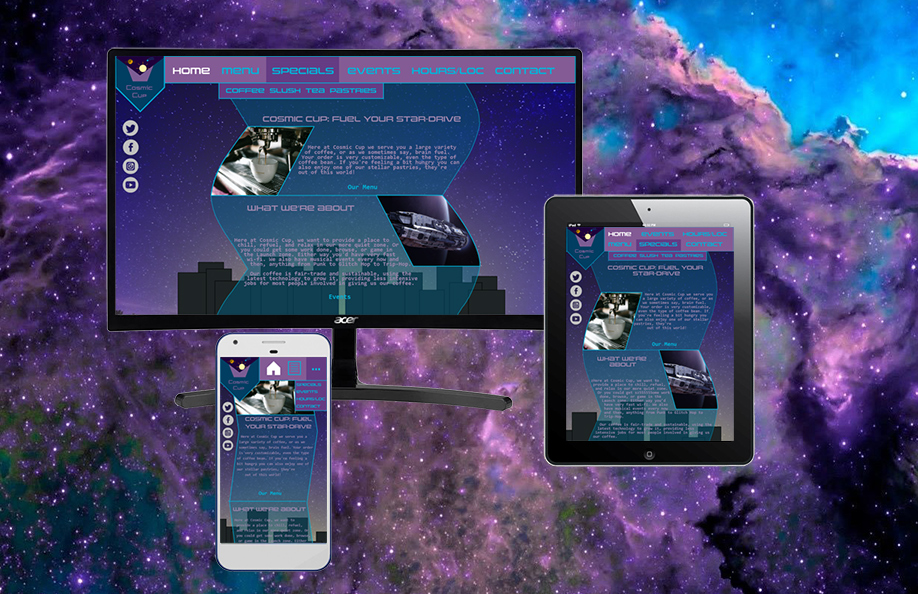
The project was for Graphic Design Publishing at De Anza College. The purpose was to create a website for some sort of small business that was a single location business. This website would have to look good on multiple types of screens like a PC/laptop screen, tablet and smartphone.
About Company:
Cosmic Cup is a coffee shop with a hard sci-fi/cyberpunk theme that caters to both people who want to drink coffee and get work done and people who want to have a good time. One of their main selling points is gigabit wifi (very good bandwidth, fast internet).
What does the company need?
A website re-design that looks good and stays true to their overall theme.
My vision for the project:
I wanted to make a somewhat simple but still interesting design for the website, something that stood out without confusing the user. I took inspiration from Retro-Wave and Vapor-wave aesthetics while still having a semi-outer space theme.
Examples of Coffee Shop Websites:
The Design Process:
Step 1: brainstorming
I thought about the project for a bit, and figured doing a cafe (coffee shop) would be a good idea since I’m a big fan of coffee. I then thought about which sub-culture I would cater to. There are lots of coffee shops already that cater to indie/hipster culture, so why not have something a bit different. I decided on a combination of hard space sci-fi and cyberpunk/vapor wave, as there was a lot of news about new rockets from multiple companies, especially the tourist space race between Virgin Galactic and Blue Origin in the summer of 2021. I also noticed when ever I was in a coffee shop there were lots of people on their laptops. Why not have a technology centered sub-culture themed cafe?
Step 2: researching into sub-culture
For this part I looked at the overall style of cyber-punk as well as retro-wave/vapor-wave, and some similar subcultures. I also looked at some hard sci-fi and outer space related websites. I noticed a common color scheme, either green and black or magenta and cyan (maybe with a bit of yellow). I decided that green wouldn’t work if there were going to be outer space elements to the design, and a lot of different nebula images I’d seen have either magenta or cyan, or both. So I had my color scheme and moved onto the next part.
Step 3: Mood-Boards
I began to work on my mood-boards, three of them. There were two different color schemes, orange/yellow and cyan, and magenta and cyan. I eventually went with the magenta and cyan with the magenta being the background dominant color and the cyan being the body dominant color. I also had the sort of look the overall website would have.
Step 4: Thumbnails
Here are the thumbnails for the layout and logo.
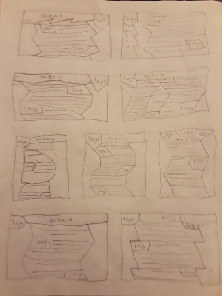

layout thumbnails
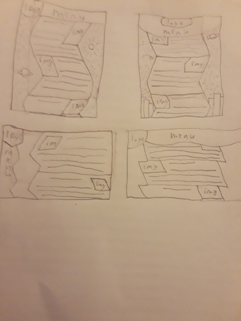
Step 5: ideations
the next step was to make a more detailed version of my favorite designs and logos.
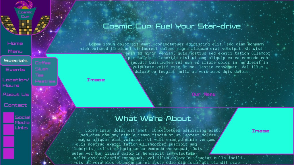
Step 6: wireframe on computer
This is the part where I actually transfer my two favorite ideations over to illustrator. The two choices were again, magenta on cyan and cyan on magenta. The two logos were also my favorite logo designs.
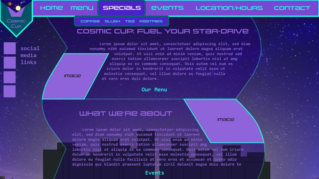
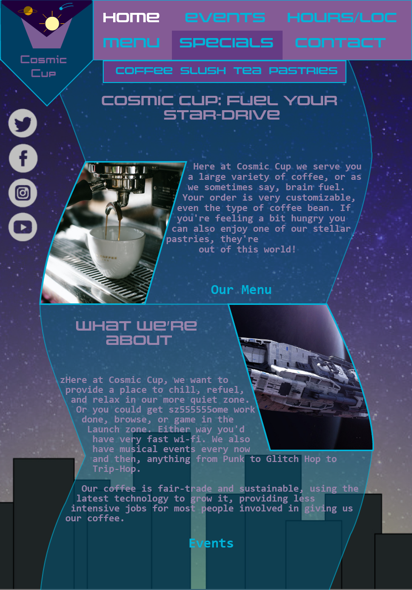
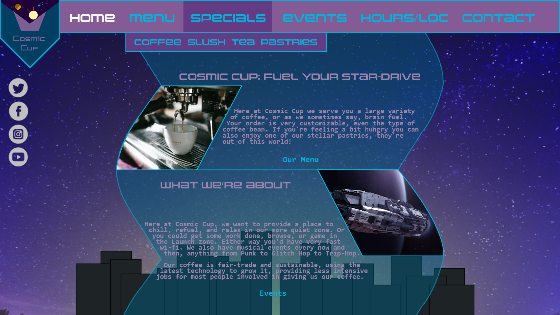
Step 7: the final Design
and here is the final design yet again.
Where will Design be Used?
It will potentially be used for the coffee shop’s website, on any device’s screen, from a Desktop PC or Laptop to a smart phone
File Types Required
jpg for thumbnails/ideations (sketches), png for final website layout
Target Audience
16-50, likes coffee and cyberpunk/hard space sci-fi/vapor-wave
Deadline
roughly a month from initial research
